
 Ravi Kumar
After years of carefully experimenting and testing new products, Google decided to start migrating the sites that follow the mobile-first indexing best practices. To recap what this means, Google’s software has begun crawling the internet to index and rank systems which typically were using desktop versions of website page content. For mobile searchers, this can cause problems and make it difficult to navigate a website.
Google’s idea of mobile-first indexing simply means the mobile version of a website page will index and rank better because it is more often what users of mobile devices are looking for. However, Google continues to use a single index when serving search results. There is no such thing as a “mobile-first index” that is separate from the current main indexing. Before now, desktop versions of websites were indexed. Going forward, the system will be using mobile versions of the same content for indexing purposes.
While all of this information makes sense to the internet savvy people, it can be quite confusing for the average person or business owner. Many people might wonder if they have to change anything on their websites. Others wonder if everything needs to be changed. To make things a little simpler, read below some more about mobile-first indexing in layman terms and what that means for everyone’s SEO efforts and building a brand. SEO stands for search engine optimisation and it is necessary for having your website pages rank well in the search engines.
What is “Mobile-First” Indexing?
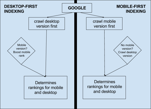
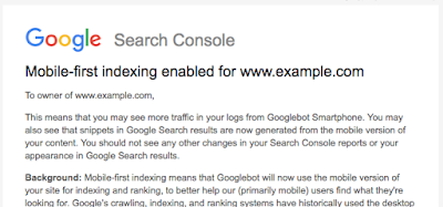
Mobile-first indexing is pretty simple to explain. Essentially, it means that Google products are going to index your website’s mobile version over the desktop version. It is the baseline for how your site will rink. If you monitor your website’s traffic, there will likely be an increase in the number of visitors from Google bots and smartphones. The cached versions of your website pages are going to be the mobile versions.
If you don’t have a mobile-friendly version of your website, you will still have your desktop site included in Google’s index. However, not having a mobile-friendly experience for your visitors can have a negative impact on how your site ranks in the search engines. These days, it is important for website owners to have a mobile-friendly option for their mobile device visitors.
Another way to think about what mobile-first means is that it is going to be the original version of your company website. If you have both a mobile and desktop version of your website that is equivalent, the change and indexing will not have a huge impact on your site’s performance when it comes to search results.
Is There Anything I Need To Do Concerning Mobile-First Indexing?
The changes to the mobile-first index methods are still in the early stages and are still being tested. Assuming your desktop and mobile versions are similar enough, you won’t have to do anything at all. If you do have another mobile site for your business, the following are things you should check on.
- Content- It is a good idea to look at the mobile version of your site and check to see that it contains the same high-quality and valuable content that your desktop site has. That includes videos, text, and images. Be sure the format on your mobile website is indexable and crawlable.
- Structured Data- For both your desktop and mobile versions of your website, similarly structured data markups need to be included. URLs listed in your structured data or your mobile pages need to be URLs for your mobile version. Any structured data that is not relevant to the content of the pages listed on it needs to be avoided.
- Metadata- Check that the meta descriptions and titles are exactly the same for both versions of your pages. Just keep in mind the official suggestion is to make sure they are equivalent and not identical. Your mobile titles will need to have shorter character counts. They will still need to include the same relevant keywords.
- Hreflang- If you use this for internationalisation, your mobile website URLs hreflang annotations will need to point to your mobile page versions in your language. Your desktop hreflang annotations need to point at the desktop versions of your site.
- Search Console Verification- Within the Google Search Console, be sure you have verified both the desktop version of your site and your mobile version.
- Media Sitemaps and XML- Verify all links to your sitemaps are accessible from your mobile site. Also verify that the robot directives and trust signals are accessible including policy pages, on-page meta-robot tags and robots.txt links.
- Social Metadata- Twitter cards, OpenGraph tags and any other social metadata needs to be included within your mobile site versions as well as your desktop website versions.
- Server Capacity- Check to ensure your host servers will be able to handle the increase in crawl rate to your mobile sites.
- App Indexation- For website owners who have app indexation set up for their desktop sites, check to ensure your mobile site versions have the same app indexation set up.
- Switchboard Tags- If you’ve completed adding the mobile switchboard tags, you will not have to make any changes and keep them the same.
What About Website Owners Who Don’t Have Mobile Versions Of Their Sites?
If you only have the desktop version of your website and not a mobile-friendly option, your content is still going to be indexed in search engines. However, your site may not rank as well as comparable mobile-friendly websites do. Not having a mobile version of your site may have a negative impact on your overall rankings because Google will now perceive your site as offering a poor experience for users compared to other sites. This is because the crawler will now be a “mobile” crawler. It can benefit all website owners by looking into getting mobile versions of their sites created.

